TOP 5 DESIGN MISTAKES IN PRINT AND SIGNAGE

When it comes to print and signage, good design can make or break the impact of your brand. A well-thought-out sign can stop people in their tracks, build trust, and leave a lasting impression. On the flip side, small mistakes in design can result in wasted budgets, poor visibility, and a message that falls flat.
To help you get it right first time, here are the top 5 design mistakes businesses make with their print and signage — and how to avoid them.
1. Poor Colour Choices
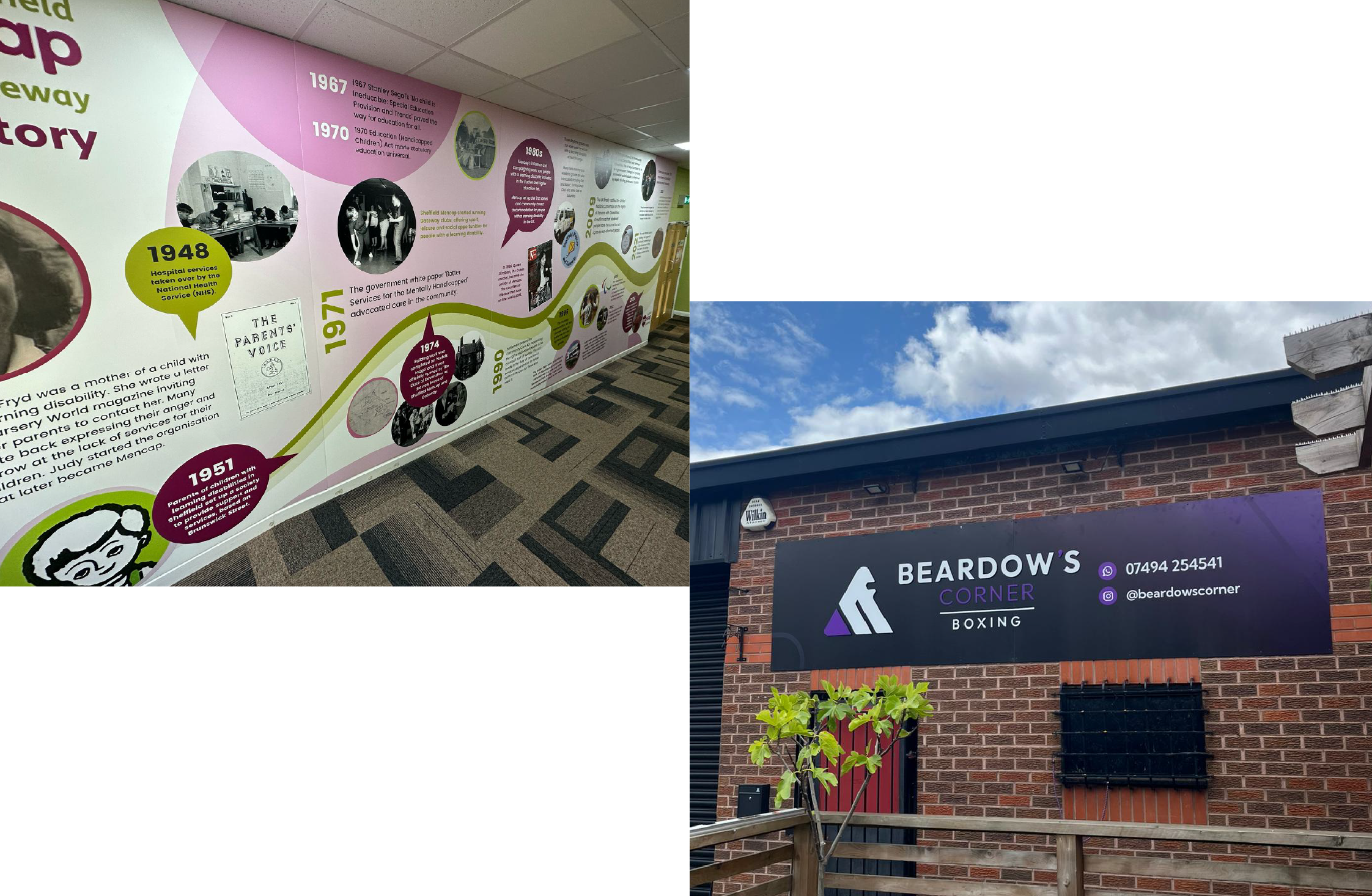
The colours you choose are the foundation of your design. If the contrast is too low, your message can be hard to read. If the shades clash, your branding can look unprofessional. And if you don’t account for outdoor fading, your sign may quickly lose its impact.
How to avoid it:
Stick to your brand colour palette and ensure there’s strong contrast between text and background. Always test print samples before committing to full production, and consider finishes that protect against UV fading.
2. Overcrowding the Design
It’s tempting to include every detail, from contact info to taglines, bullet points, and imagery. But too much information overwhelms the viewer and makes it difficult to know what’s important. Remember: most signage is viewed in a matter of seconds.
How to avoid it:
Keep your message short and sharp. Use hierarchy in your design (headline first, key details second), and make sure there’s plenty of white space to let your message breathe.
3. Wrong Sizing or Scale
Logos that are too small, text that can’t be read from a distance, or graphics that don’t fit the allocated space are all common errors. A sign that looks good on screen might not translate once it’s installed in the real world.
How to avoid it:
Always design to scale. Create mock-ups in situ to check how your design will look from different viewing distances. And consult with signage experts who can recommend the right dimensions for maximum visibility.
4. Ignoring Material and Finish
The design itself might be perfect, but if you choose the wrong material or finish, the final product can let you down. Gloss finishes can create glare, thin materials may warp outdoors, and cheap substrates can reduce lifespan.
How to avoid it:
Think about where your signage will live, indoor or outdoor, temporary or permanent. Choose finishes that complement your design (matte for readability, gloss for impact) and invest in durable materials that stand the test of time.
5. Inconsistent Branding
Your signage is an extension of your brand. Using different fonts, logos, or colour variations across different pieces creates confusion and dilutes your professional image. Consistency builds recognition and trust.
How to avoid it:
Work from brand guidelines, ensuring your logo, fonts, and colours are applied consistently across all print and signage. This creates a cohesive look that strengthens your identity at every touchpoint.
Final Thoughts
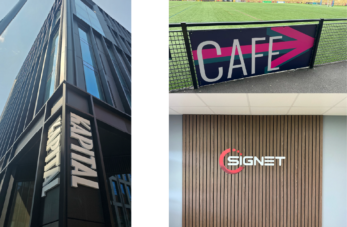
Avoiding these five mistakes can transform your signage from forgettable to unforgettable. By focusing on clarity, consistency, and the right design choices, you’ll create branding that stands out for all the right reasons.
At Pinders, we help businesses of all sizes bring their vision to life with print and signage that’s not just eye-catching, but effective. If you’d like expert advice on your next project, we’d love to help.
Explore More of Our Work
Looking for a signage partner for your next fit-out?
🥊 View our case studies
📞 Contact us to talk about your next project
📍 Specialists in office signage, branding, and wall and window graphics — based in Sheffield, working across the UK and beyond.
