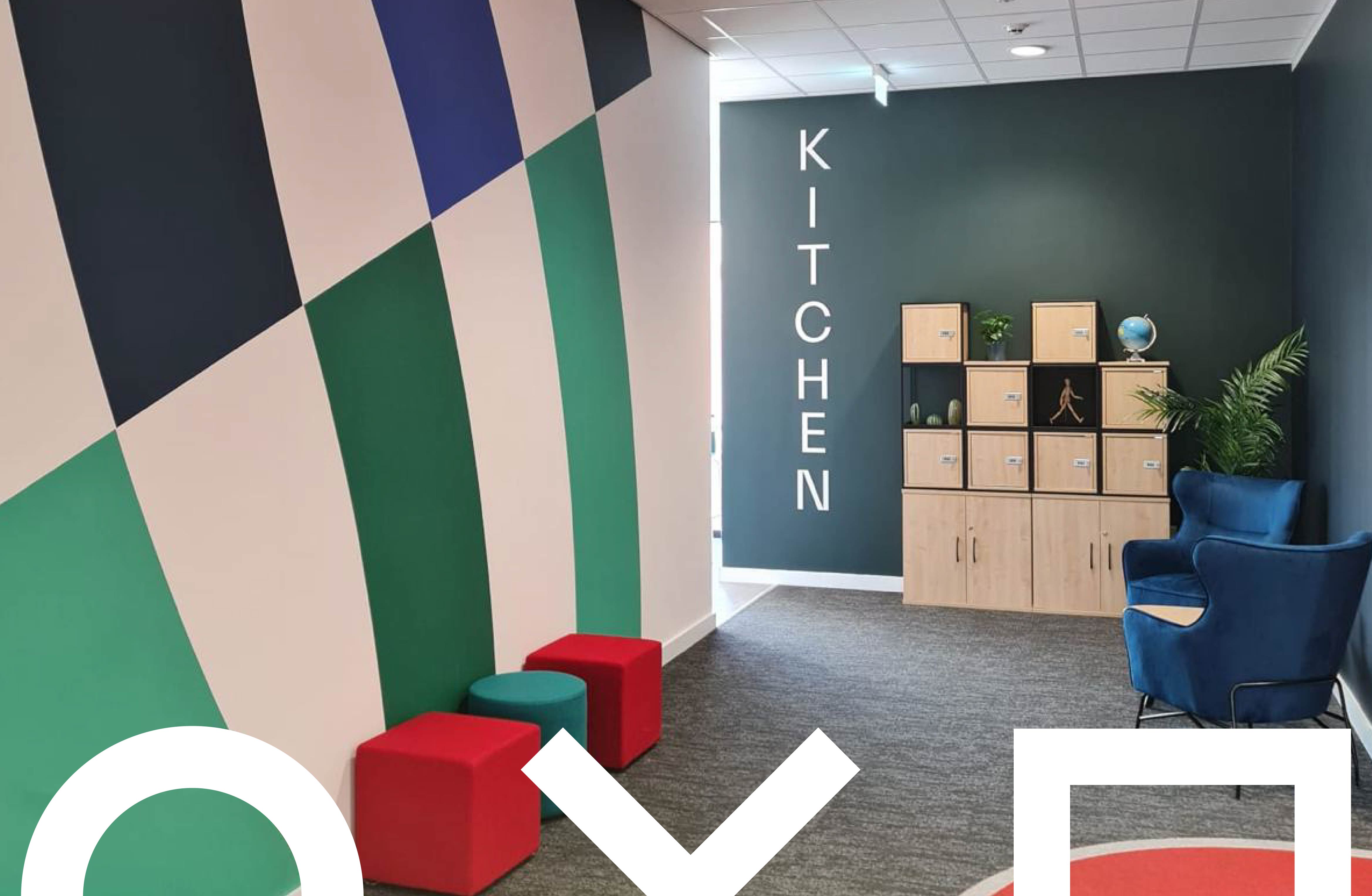
THE DO’S & DON’TS OF WALL GRAPHICS
Wall graphics are one of the most effective ways to transform a space. From branding and wayfinding to inspiration and storytelling, they can completely change how an environment feels and functions.
But while wall graphics can look incredible when done right, poor planning or incorrect material choices can quickly lead to disappointing results.
Whether you’re branding an office, school, gym or commercial space, here are the key do’s and don’ts of wall graphics to help you achieve a professional, long-lasting finish.
✅ DO: Consider the Purpose of the Space
Before designing anything, think about what the wall needs to achieve.
Is it:
- A branded statement wall?
- Wayfinding or directional signage?
- An inspirational or educational display?
- A practical surface such as a drywipe wall?
Understanding the purpose helps determine the design, scale, material and finish, ensuring the wall graphic works as intended rather than just looking good on screen.
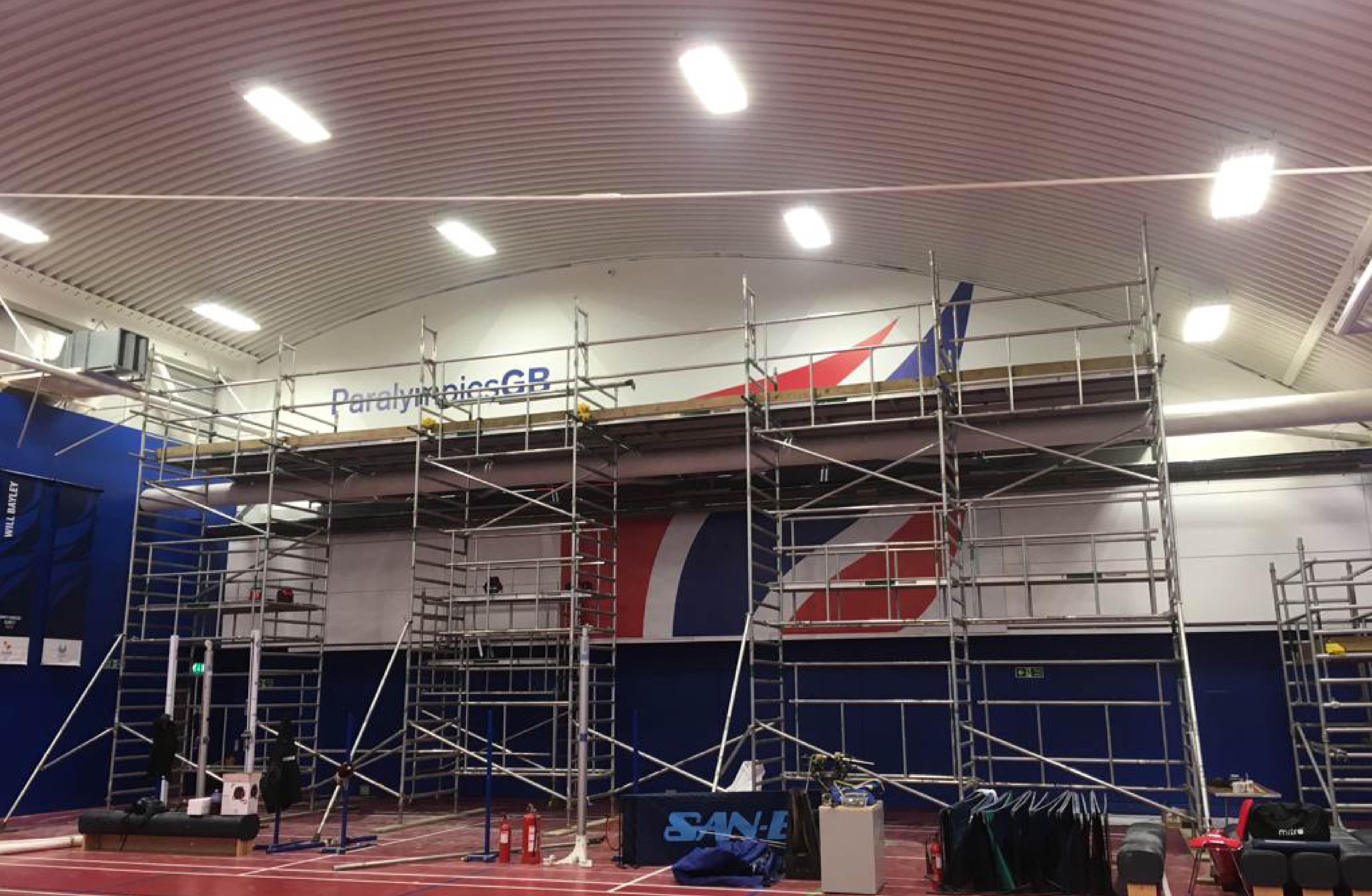
❌ DON’T: Treat All Walls the Same
Not all walls are suitable for the same type of graphic.
Paint type, surface texture, age of the wall and even temperature can affect adhesion and finish. Brick, blockwork and freshly painted walls all behave differently.
Failing to assess the surface properly can lead to peeling, bubbling or poor durability, which is why site surveys are such an important part of the process.
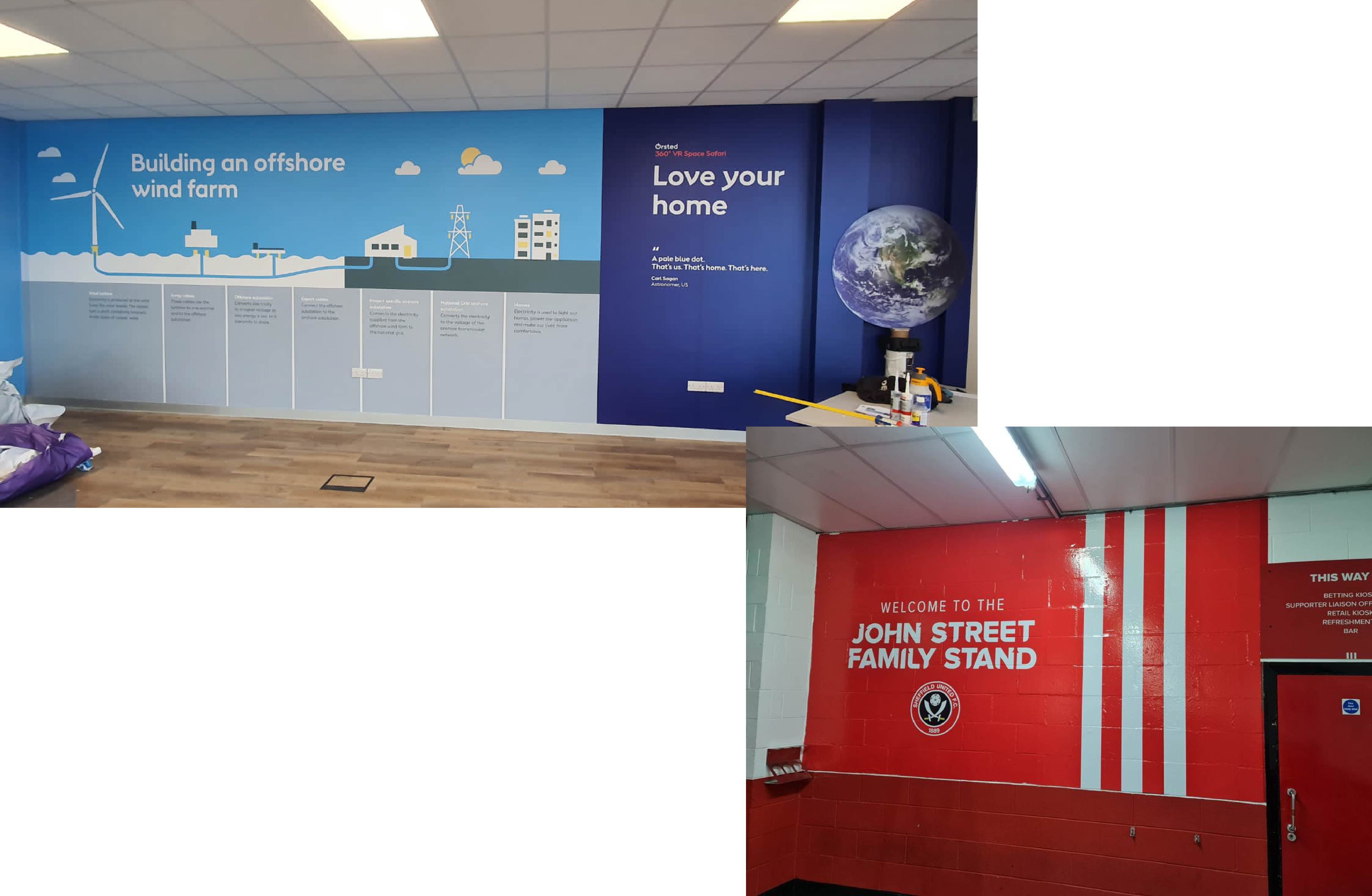
✅ DO: Choose the Right Material
Material choice is critical to the success of wall graphics.
Some vinyls are designed for:
- Smooth plastered walls
- Textured or uneven surfaces
- Removable or temporary applications
- Writable or wipeable finishes
Using the correct material ensures strong adhesion, clean edges and a finish that lasts, especially in high-traffic environments like schools, gyms and workplaces.
❌ DON’T: Overcomplicate the Design
Wall graphics are often viewed from a distance, or while people are moving through a space.
Too much text, small fonts or overly complex layouts can make graphics difficult to read and visually overwhelming. Clear messaging, strong hierarchy and considered spacing will always deliver better results.
Sometimes, less really is more.
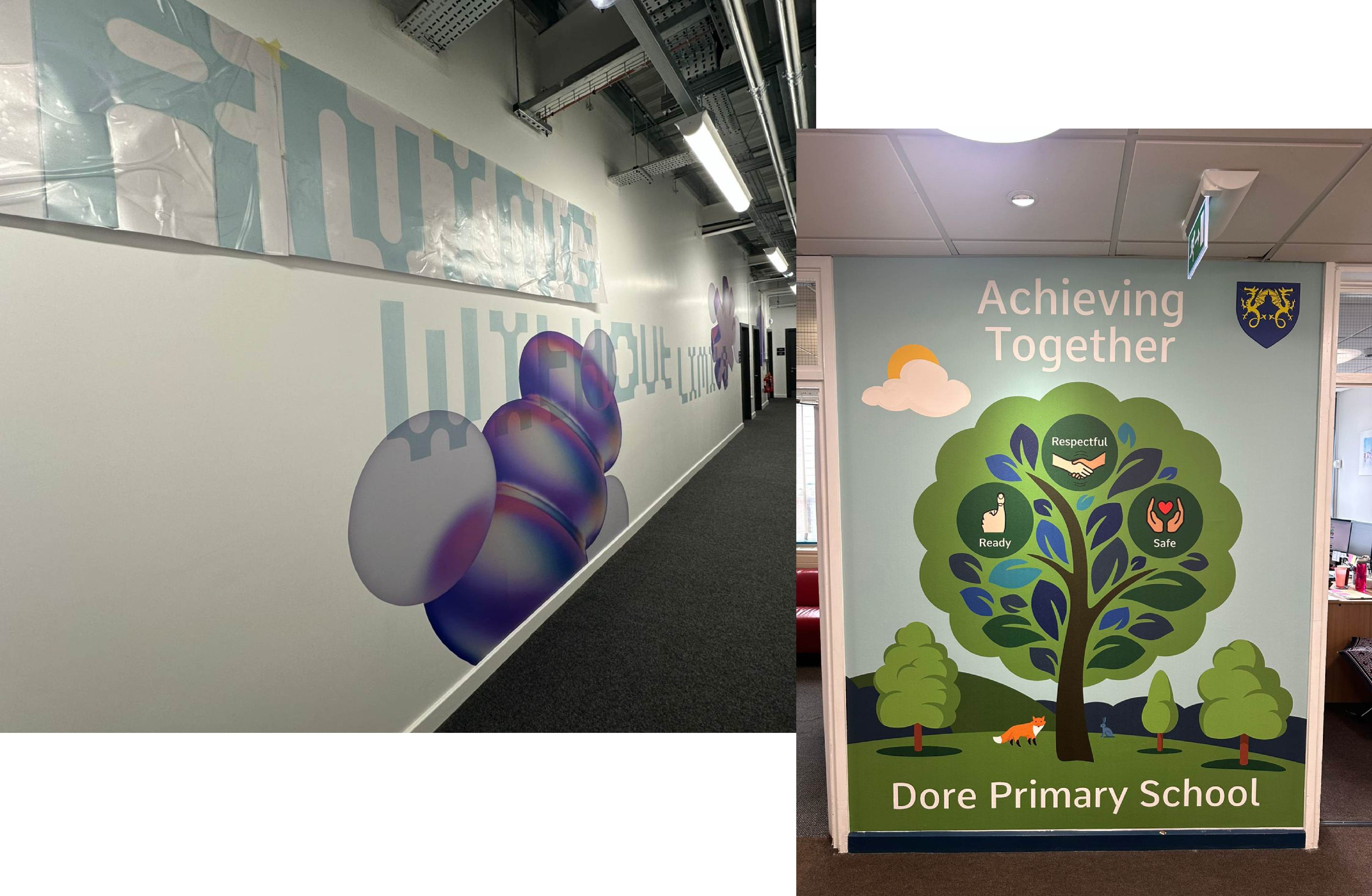
✅ DO: Think About Scale and Positioning
A common mistake with wall graphics is getting the scale wrong.
Graphics that are too small can feel lost, while oversized designs can dominate a space unnecessarily. Positioning also matters, consider sightlines, furniture placement and how people move through the room.
A well-scaled wall graphic feels intentional and balanced, enhancing the space rather than overpowering it.
❌ DON’T: Ignore Lighting Conditions
Lighting can dramatically affect how wall graphics appear.
Natural light, spotlights, shadows and reflections can all impact colour and legibility. What looks perfect on screen may look completely different once installed on site.
Planning around lighting conditions ensures colours remain true and graphics stay readable throughout the day.
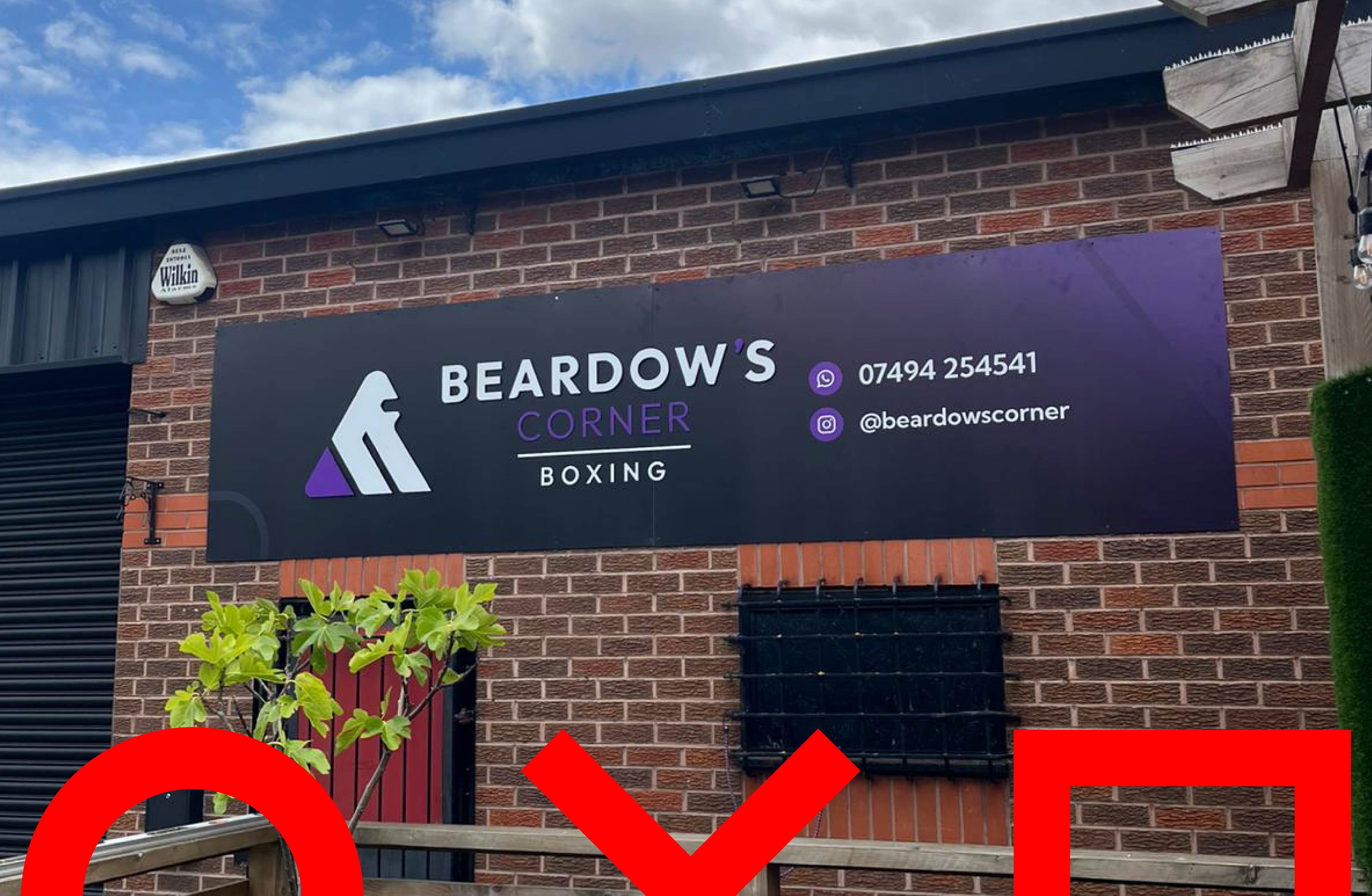
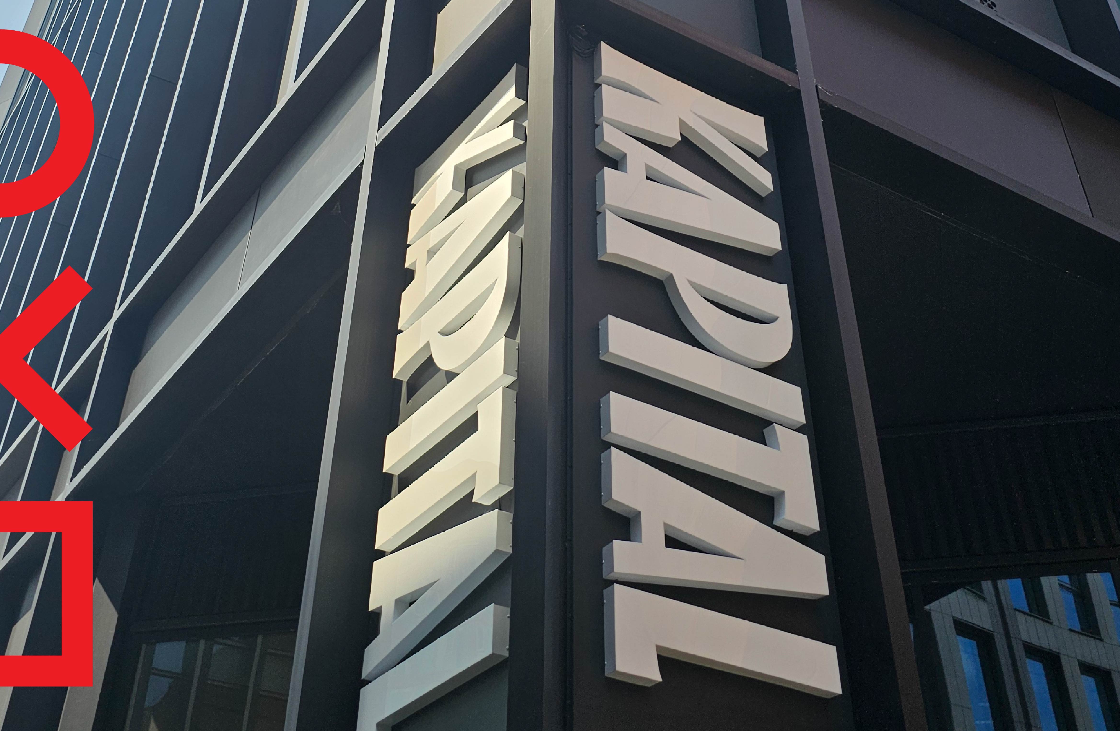
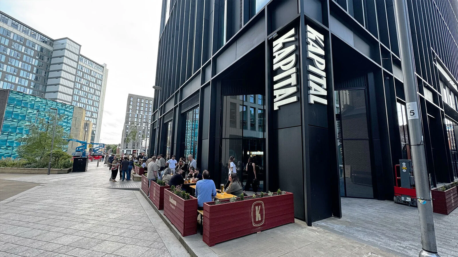
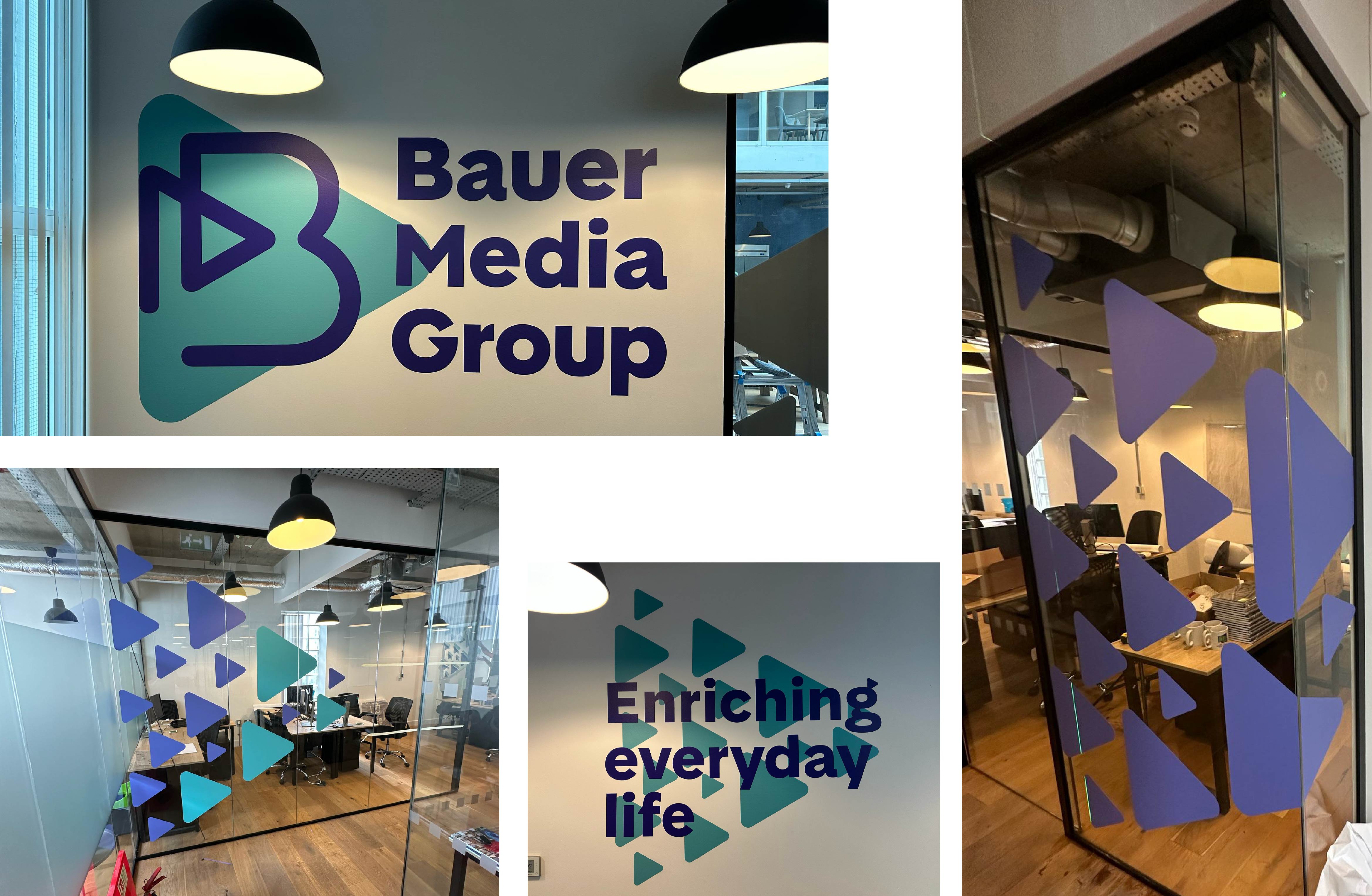
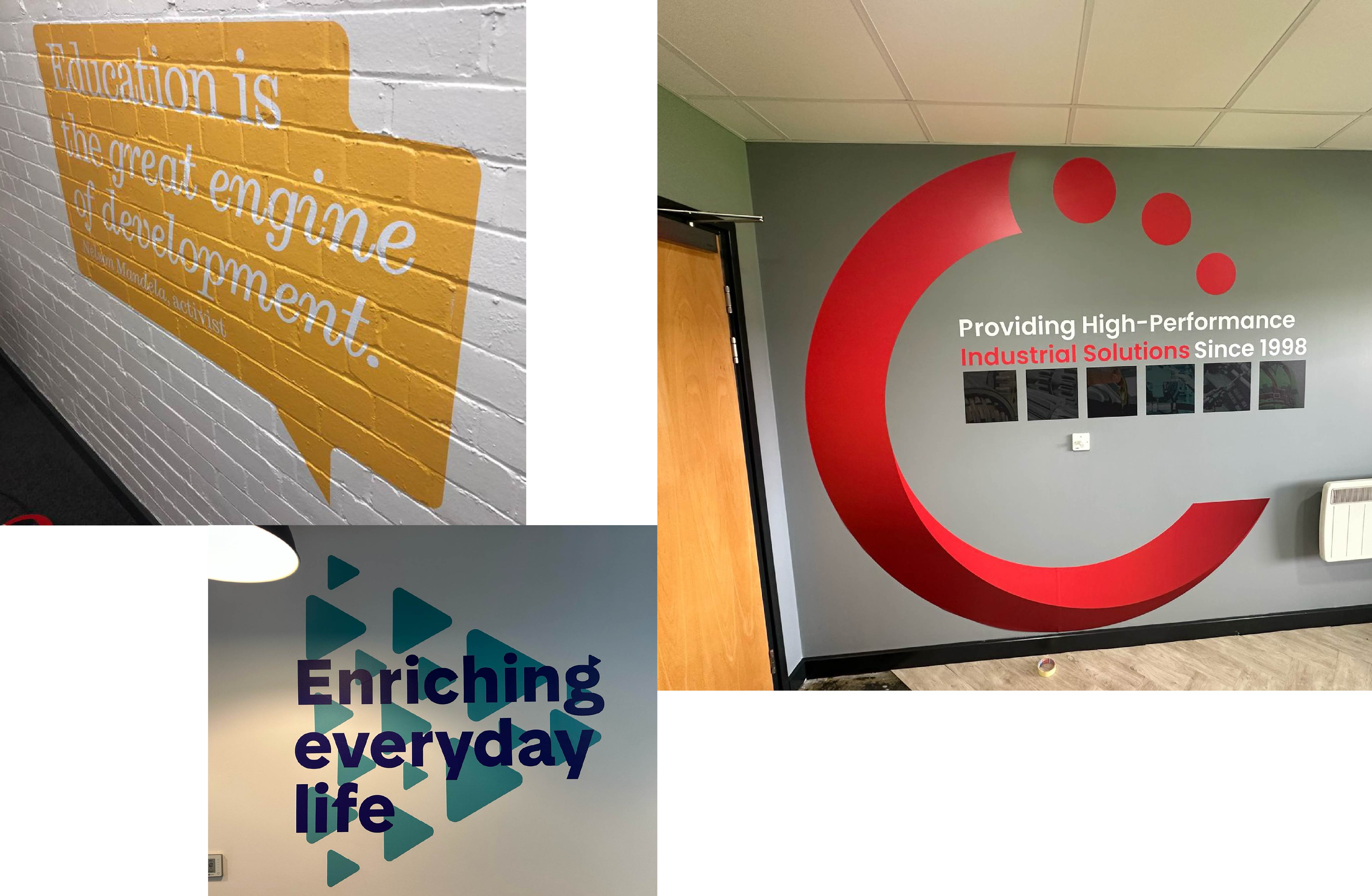
✅ DO: Use Wall Graphics to Support Brand Consistency
Wall graphics are a powerful branding tool, but only when they align with your wider identity.
Colours, fonts, tone and messaging should match your signage, print and digital presence. Consistency builds recognition, trust and professionalism across every touchpoint.
This is where working with a team who understands branding, print and signage together makes a real difference.
❌ DON’T: Forget About Durability and Maintenance
Wall graphics aren’t always “fit and forget”.
High-traffic areas may require tougher materials, while schools and public spaces benefit from wipeable or scuff-resistant finishes. Planning for longevity from the start avoids unnecessary replacements later on.
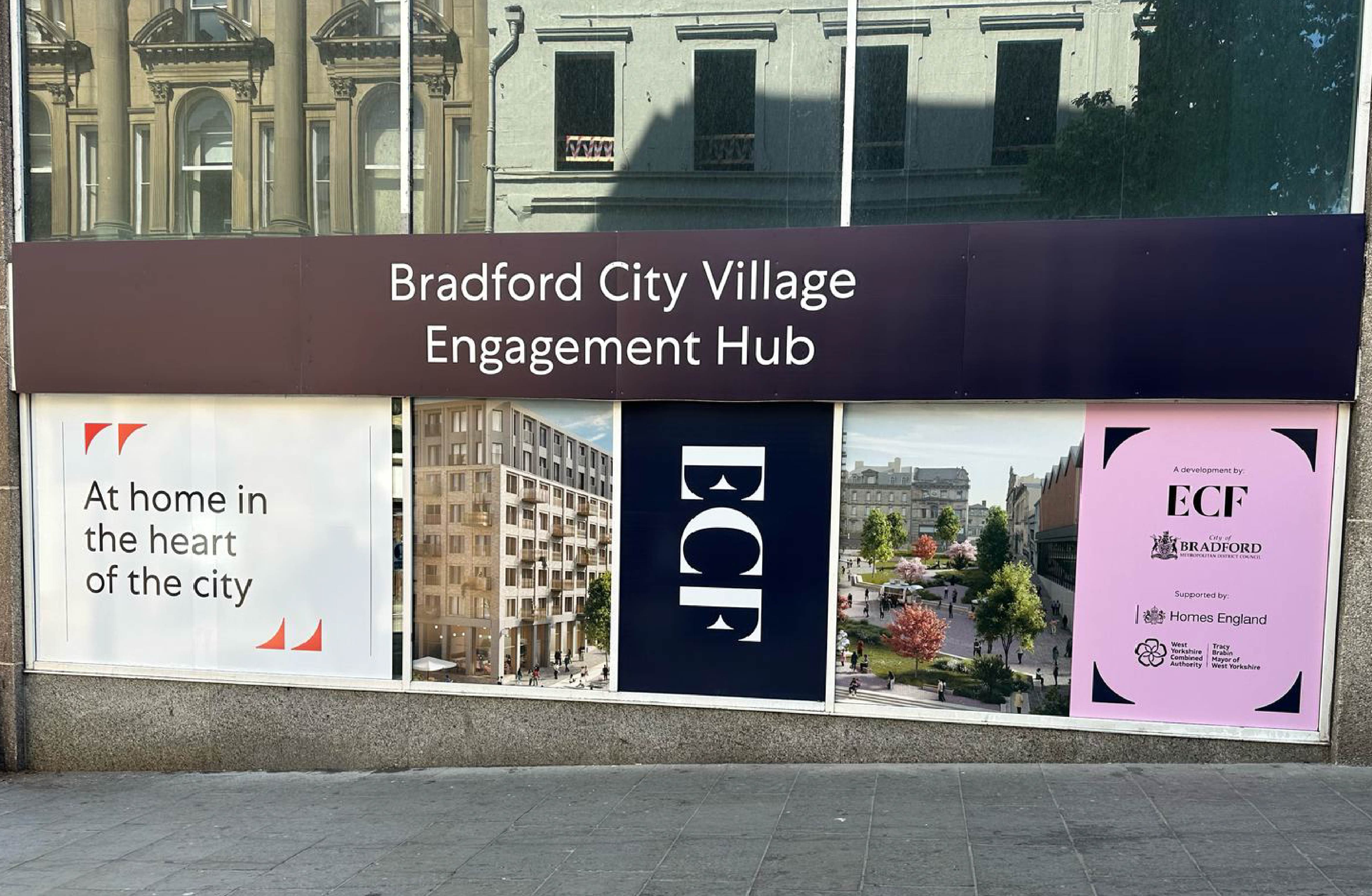
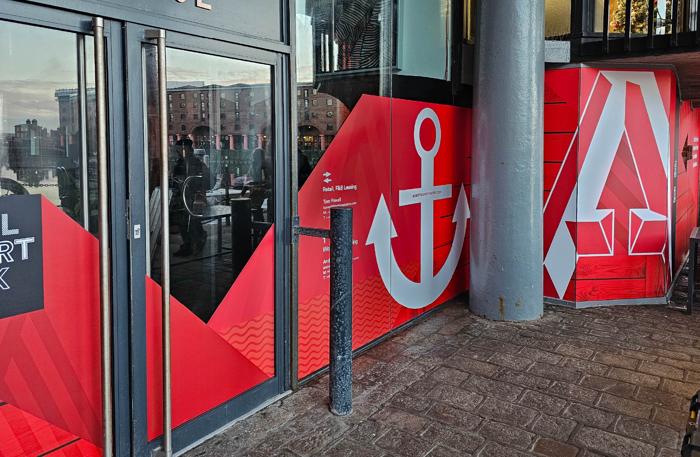
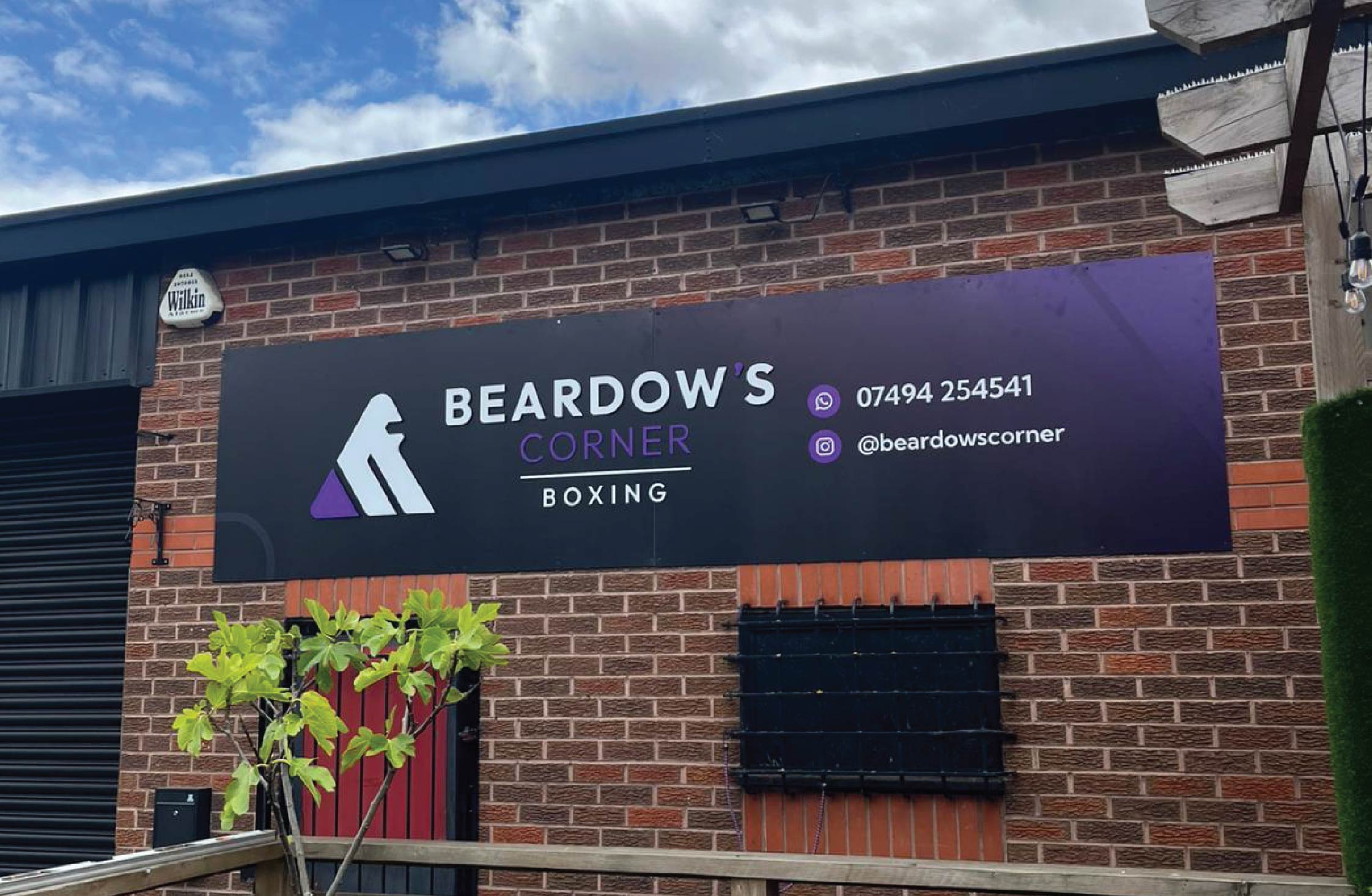
Wall Graphics Done Right
When planned properly, wall graphics can elevate a space, reinforce your brand and create environments people enjoy spending time in.
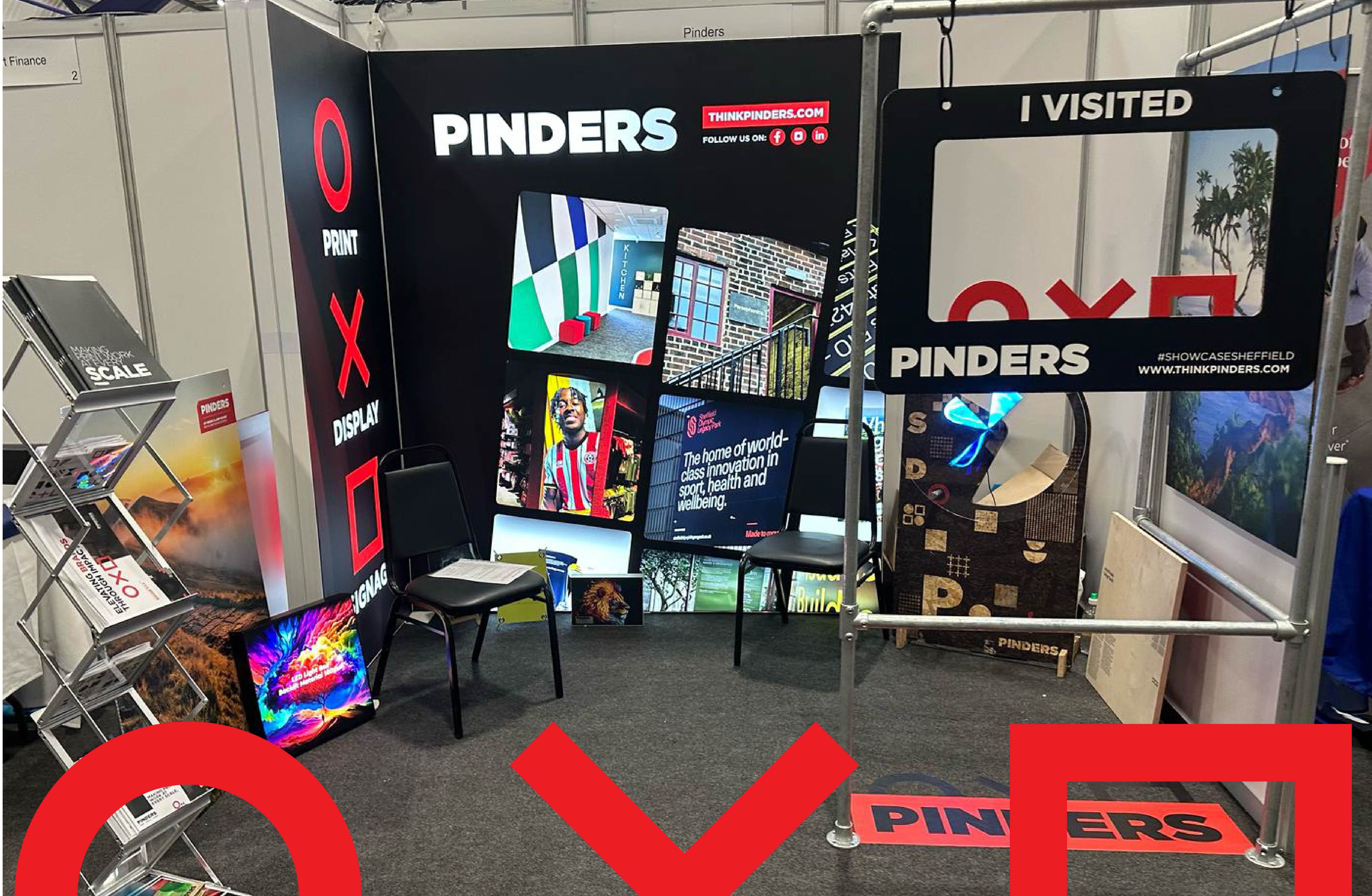
At Pinders, we design, produce and install wall graphics that are tailored to the space, surface and purpose, ensuring a professional finish that lasts. From initial design and material selection through to installation, we take care of the full process.
Explore More of Our Work
Thinking about wall graphics for your space? Get in touch with our team to discuss your project.
Read more about our wall graphics
View more case studies
Speak to us about wall graphics, print and signage
Specialists in wall graphics, signage and branded environments, based in Sheffield, working across the UK (including Manchester, Leeds, Birmingham, Doncaster, Rotherham) and beyond.